top of page


ESTD 2014
MUMBAI BASED

INTENT
India’s first luxurious Ayurveda brand.
Rooted in Indian heritage, crafted
for today
CLIENT
FOREST ESSENTIALS
YEAR
2011 - 2023
In 2011, Forest Essentials asked us to help transform the perception of Indian Ayurveda from a homegrown do-it-yourself tradition to a luxurious lifestyle practice. It became clear to us that the brand stood for “luxurious Ayurveda”.
We rooted ourselves in Indian culture, experimented with Indian styles of art for the brand’s visual identity and set ourselves the challenge to broaden the Indian mindset about this ancient repertoire of knowledge and ritualistic care.
SERVICES
BRAND STRATEGY • MANIFESTO • VISUAL & VERBAL LANGUAGE • BRAND TYPOGRAPHY • PACKAGING DESIGN • GIFTING RANGES • RETAIL PACKAGING • SPECIAL PRODUCT LAUNCHES • LIMITED EDITION PACKAGING • OVERALL PACKAGING SYSTEM •BRAND EXTENSION IN STORE • STORE EXPERIENCE • SIGNAGE AND ENVIRONMENTAL DESIGN • SPECIAL CAMPAIGNS • BRAND FILM FOR VOGUE EVENT •NEW VERTICAL SUGGESTIONS • NEW PACKAGING UPGRADE • OVERALL BRAND ART DIRECTION.

Year after year, we created original designs by bringing together contrasting ideas and expressing them through modern techniques. Each product line had its own distinct identity while remaining part of a cohesive visual language under the umbrella brand. The results speak for themselves: Forest Essentials has become a benchmark in its category, and the design language we created has set the standard that other brands now aspire to.
MTD's process began by identifying the three core aspects of the brand, anchored by what we called the three M's
MOUNTAINS

Represents the origin, the mountains of Hrishikesh, where the ingredients of the
products come from.
MYTHOLOGY

Captures the foundational story of ayurveda that we draw our inspiration and design elements from.
MODERNITY

The lens through which the story is told - our aim is to find a way to present the mythology in a modern context.

VISUAL STRATEGY
We were shaping a brand identity that had no precedent.

OLD PACKAGING
When we began strategising, our only references came from two opposing ends - international apothecary-style brands like Aesop, and traditional Ayurvedic products with a medicinal purpose. Ayurveda and Indian luxury had not co-existed in the Indian brand market yet. This absence of a reference point became both our challenge and our biggest opportunity. For our inspiration, we looked to mythology and royal traditions to create our own tapestry.
BRAND ARCHITECTURE
-
POMEGRANATE
-
ALMOND, PISTACHIO
AND HONEY
-
SAUNDARYA RANGE
-
SANJEEVENI RANGE
-
TEJAL AND RASA
-
OJAS
-
DATE AND LITCHI
-
BUTTER SILK SOAPS
-
SOLID PERFUMES
-
FACE MASKS
-
MOTHER AND BABY
CARE RANGE -
INCENSE STICKS
DESIGN PROCESS
We set out to build a philosophy for a brand that is both timeless & new.
The name itself - Forest Essentials - is rooted in place and purpose. Every ingredient is taken from the forests of Rishikesh: plants, herbs, and trees. The products are hand-crafted in the villages of Uttarakhand using local labour and traditional methods. This commitment to purity and care extends to every part of the process, including ours.
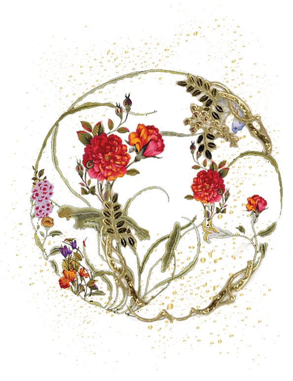
There’s more than one way to experience Luxury. To celebrate this, we created three separate styles for each of the three product ranges. We drew from Mughal traditions and architecture and from representations of Indian mythology in different styles of Indian painting. Key ingredients were highlighted with styled motifs and we introduced colour blocking to distinguish between the ranges.

HOW WE DEFINED THE BRAND COLOUR PALLETE INSPIRED FROM HERITAGE AND NATURE
.png)
WE BORROWED THE INGREDIENT STORY AS SEEN IN THE INDIAN ARCHITECTURE
RETAIL PRODUCTS

POMEGRANATE
This range is designed around contrast. The sharp citrus of Kerala Lime is layered with the tangy sweetness of pomegranate. The anars bursting with juicy nector and the kerela lime paired with the sweet bloosoms of its flowers, accented by Mughal-inspired motifs.


ALMOND, PISTACHIO
& HONEY
We wanted to keep it as true as possible to the almond tree where soft pink flowers frame the fruit. The base of the label reflects the pistachio giving the whole product a summer feminine touch.


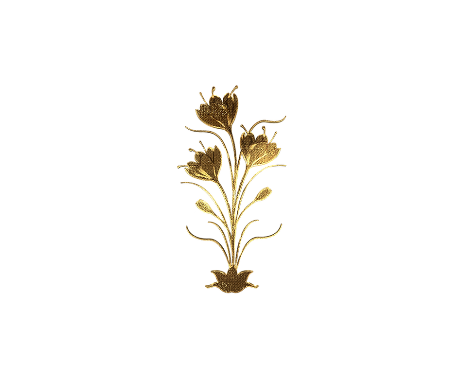
The Premium and Special Edition ranges called for a design language that felt rare and luminous like the formulations themselves. The product included ingredients like gold, saffron and sandalwood, embodying richness at every level. Our approach mirrored this. We used gold detailing, deeper tones and accents inspired by Indian ornamentation. We created unique interpretations of the ingredients that are opulent and slightly surreal.
PREMIUM RANGE


SAUNDARYA RANGE
Inspired by divinity.
The design for the Soundarya range, infused with 24-Karat gold, needed to reflect both reverence and radiance. The Hindu goddess of wealth and prosperity, Lakshmi, stands for self realisation, emotional fulfilment and spiritual liberation. We took inspiration from her beauty and abundance by using a jewel-toned palette, motifs of sun and moon rays to capture a sense of rejuvenation, and the image of the lotus which represents purity and rebirth. This range is recognised as one of the most iconic collections in the Indian beauty industry.
Inspired by the legendary beauty of the lotus eyed, goddess Lakshmi- an icon of beauty who believed to have pioneered the use of pure Gold for her skin care rituals; Forest Essentials’ 24 Karat Gold infused Soundarya range is recognised as one of the most effective and iconic collections in the Indian beauty industry.


SANJEEVENI
The aesthetic of rejuvenation.
Mythology tells us that the Sanjeevani herb resuscitated Lakshman after he was injured in the battlefield by Ravana. Inspired by the herb which is the key ingredient in this range, the packaging draws from the idea of revival and regeneration. An aquamarine palette evoke the forest origins of the herb. As a continuing part of this range, the gold suggests divine potency. The cold infusion of this herb is the mainstay ingredient of the brilliant, award winning Sanjeevani Beauty Elixir.


TEJAL AND RASA
Lustre and essence bottled.
Tejal, meaning radiant, and Rasa, meaning taste, form a ritual that offers the skin’s first drink of the day. Our design captures this with luminous, dewy tones. The clear bottle offers transparency and when combined with the water-blue palette, evokes the stillness of early hours and quiet self care.


OJAS
Packaging that blooms with vitality.
Taking inspiration from the first rays of sunlight filtering through the forest, we combined warm golden-orange tones with floral patterns inspired by Indian blossoms like the marigold. The intricate detailing blend heritage styles with elegance. The tactile finish of the jar’s gold lid suggests luxury.


DATE AND LITCHI
Rich, satisfying ingredients made visible .
We created detailed botanical illustrations that represent the character of the ingredients. Soft pink and terracotta tones reflect the fruits’ essence. The uncluttered layout allows the playful softness of the blend to feel weightless.

TEJASVINI
Hues borrowed from tradition
This formulation of pure cow’s ghee speaks to nourishing richness.The deep tones are anchored in one of the main ingredients of this range - saffron, a sacred colour that represents purity. We were inspired by the colour of the product itself that resembled “ kumkum” We used it to create a sense of ritual and employed gold accents to balance it with opulence.


SPECIAL EDITIONS


BUTTER SILK SOAPS
Design that honours the ingredients
Forest Essentials Luxury Butter Soaps are crafted as nourishing cleaning rituals. These formulations were very special as they could only be made my the oldest soap maker in the village of Rishikesh. While making these luxury soaps we faced a special challenge of making sure the smell and the oil didn't escape after packaging. we employed a special Japanese technique of origami , folding the paper in folds as we packaged and sealed the product.


SOLID PERFUMES
Scents cast in gold.
The solid perfume’s design reflects its characteristics. Encased in a gold cases, it feels more like a keepsake or a gift perfect for self pamper or festival season. Smell is personal and thats why the mirror reflects the act of looking after ones self - pleasuring the senses


FACE MASKS
Ayurvedic leps - A product that really needed to be modernised
As the beauty market grew - there was a need for quick solutions. Ayurveda is known for its long term benefits, when we talk Ayurveda we don't talk efficacies so here we had a challenge how do we make Ayurveda relevant in this market? Face mask was the answer, something that had never been done before a natural face mask with all its purity. We came up with there beautifully illustrated scenes that mimicked the benefit of the product wether it was hydration, anti-aging or glow.


NEW VERTICALS
BABY & MOTHER
A design language for gentle beginnings.


The Forest Essentials Baby Care range designed for the modern moms that believe in the old age wisdom. Soft and playful it needed that touch of the old worlds charm, wooden toys, rattles with bells and that wooden horse that was very familiar. All this created an atmosphere of comfort and play. The overall palette and illustration style evoke familiarity while maintaining the brand’s promise of authentic pur luxury for your precious one.


INSENCE STICKS
Royal smells of the havlis
A walk through the royal garden's, a pause at the Indian temple, a with of the maharanis ittar we wanted to capture it all in these special incense packaging that guaranteed teleportation to the royal world. The vivid, saturated colours for each incense create an immediate connection to emotion.


We led the art direction across environmental design, lightbox installations, visual merchandising suggestions, story cards, shelf talkers, and the packaging and gifting experience. Below are some images capturing the products in store photography.


THE TEAM
SHRUTI SINGHI
Founder & Creative Director
SHREYA KAPOOR
Senior Designer
MERLYN TOPPO
Senior Designer
THE IMPACT
Our work helped transform Forest Essentials from a niche ayurvedic label into a luxury brand with national reach and international appeal. Mother Tongue Design’s contribution helped the following:
• Took the brand from 1 store in Delhi to 30 + across the city in just a few months
• Supported expansion to a pan-India retail presence
• Involved in the brand’s international growth and global recognition
Mother Tongue Design’s work with Forest Essentials transformed the brand’s identity into a visual language that felt both grounded and elevated by drawing from Indian tradition, but rendering it with a sense of myth, modernity through detail and hyperreal clarity.
Reference images are only for inspiration purposes @pinterest
bottom of page